This is the critique series where I will critique photos sent in by individuals. Submissions are voluntary and as anonymous as I can make them. If the owner of critiqued photos which to be known, they can post their comments below. For now, I may entertain some discussion around the critique via the comments section, but again, these are my opinions and I don’t know everything.
The Critique
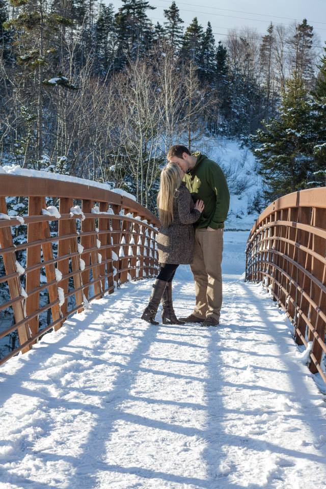
This photo is the second in my series of photo critiques and I think it is quite appropriate for the upcoming season – especially because I secretly love this season. I love it not so much for the snow cleanup, but for images and lighting like this, the outdoor activities, and the magic that’s in the winter air.
The first thing that I notice about the image is nice directional light which is something photographers should be looking for. If you have to shoot in bright daylight you should either shoot during the morning hours or evening hours like when this photo was shot, you should find an awning or some covering that will create ambient directionality, or finally, use a flash of some sort to create some direction. The only downside to using such strong directional light is strong directional shadows. This particular photo does not have a big issue with the shadows, but the shooter can consider using a bit of flash or a reflector to fill in the faces on the subject(s) – it’ll add a little pop and separate them from the background and even out the lighting on the couple so it’s not so contrasty. While still on the topic of light, the pattern created by the sun through the bridge is quite interesting and could be a subject in and of itself, but I feel that it’s adding a busyness to the photo that either does not need to be there or needs to be exploited. I really do like the lighting of this photograph, so I would try to emulate the sun and try to overpower the light on her back and try to remove those square shadows cutting through that nice beam of light. If you were adventurous, adding two lights in the form of a key light and rim light would be especially interesting. Also, it would also help add more separation from the background.
Note: Flash positioning in a photo like this is critical. If you’re trying to light the subject at or above the same level as the sun, the flash should come from the same direction as the sun (camera left). If you’re filling in the shadows at a level less than the sun, the flash should be opposite the sun (camera right).
The only thing that really bothers me about the photo is the placement of the subject within the frame. I feel that one of two things need to happen: 1) They need to be horizontally centered in the frame so that the rails of the bridge on both the left and the right are equidistant on either side of the subject or 2) they need to moved so they are placed on one of the crash points via the Rule of thirds. The reason for this is the notion of Leading Lines. These are the lines that guide the eye through the picture and while apparent in the photo, they’re not as prominent as they could be. Option 1 emphasizes these leading lines by using symmetry that re-enforces where the eye should go because you have two very strong, identical lines leading into the subject. Option 2 would ensure that the two lines are different, one vastly stronger than the other and would become a sole leading line. Based on what the shooter was doing, I feel the shooter was trying for option 1 and I agree that it would be best. The only other thing I would do, and this alludes to exploiting those shadows, is I would try moving the subjects up in the frame and shooting lower, cutting out the trees and allowing the shadows to also become stronger leading lines. I’ll try to do a crop to illustrate below, but the shooter was not centered on the bridge either so the key-stoning may be off.
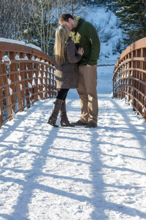 This is the idea, but I think shooting from a lower angle would work and making sure the same amount of gap either side of the subjects is also needed.
The next thing I would like to talk about are the subjects. Being a portrait photographer, it’s our responsibility to make sure the people are also part of the image (not just in the image). In this sort of shot, the shooter wishes to portray love, endearment, togetherness so the body language should match that. I feel the female in the shot is doing a spectacular job. I lover her hand placement, her lifted heel and pointed toe (we love points for female subjects) but the guy in the shot sorta looks like he was dragged there. I can appreciate the difficulty of working with men, we can be downright cantankerous with photo sessions, but we have to motivate them to participate in the shoot — hell, sometimes we have to physically move them! In this shot, I would like to see the guy’s hand out of his pocket and on her hip conveying the same loving emotions as the female, it would really tie the image together nicely. If the two weren’t kissing, having them looking at each other and smiling or laughing would also be a great emotion for this shot. One other quick note, outfits should coordinate in some respect, he needed to dress up a little in a similar color palette.
The last thing I would like to talk about is the background, and this goes for all backgrounds, we need to eliminate distracting elements. While most often this would be things like garbage, or weird bright objects (i.e. those bright blue rooftops at the park), it also includes elements growing out of people. The trees in the background are growing out of the guys neck and with the centered cropping it would be very difficult to avoid this, using a longer lens, wider aperture, or both would blur the background making the trees just look like balls of color and not quite so distracting. You’ll notice that in the crop version of the image, the growth is less noticeable, but some bokeh would go a long way here. If we cropped like option 2 above, we might be able to get the subject’s heads in the snow patch just to the right of the guy, but it may become too difficult to make the rest of the image work if we had done that.
Finally, a little more saturation in the colors would be great for my tastes, but that is completely subjective. Composition is paramount in this image and it was almost there. This shot was well executed and could easily become a great image with a few minor tweaks! Good Job!
Bonus:
Try using shadows to create interesting patterns on people. In this case, I think you may have been able to use the shadows to do some framing around a face.