This is the critique series where I will critique photos sent in by individuals. Submissions are voluntary and as anonymous as I can make them. If the owner of critiqued photos which to be known, they can post their comments below. For now, I may entertain some discussion around the critique via the comments section, but again, these are my opinions and I don’t know everything.
The Critique
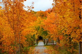
This was the first photo sent to me, and from the time I opened it all I could think was “Wow, the Orange!” The Orange tones in this image are stunning as it’s a beautiful autumn picture, but I feel that I would like to see some contrasting tones and colours. The greens in the picture are very under played and would add a little extra contrast, depth, and range to the picture. The current processing almost makes the image look monochromatic, so consider bumping up the greens to add that extra little pop. It looks as if the day the photo was taken was also overcast, if not, try bringing the blues out in the sky, or going back at the golden hour(s) to get some nice directional lighting. Adding a little more atmosphere or mood would certainly help — maybe the movement of some leaves or flies buzzing about.
The second thing I love about this image is the symmetry and framing of the walkway. The tunnel effect is something I personally often look for in these types of photos because it add depth and a sense of direction — it really gets the viewer looking through the image. I feel that an improvement here would be to get a little lower (and maybe closer) to exaggerate the focus of the picture to the walkway keeping it nice and framed by the large trees. If the shooter was to go back and try this again, maybe getting closer and using a wider focal length, it would give a different perspective and add a bit of scale with regard to the trees.
The appropriate orientation of the photos, aptly called landscape, was used but the tilt of the camera would need to be adjusted so the horizon was level. If the photographer was to get lower for this shot, the key-stoning issues that would arise from the fencing would also be mitigated, and we may also get some extra leading lines from the leaves on the pathway.
Finally, while the picture that was submitted was almost too small to view any detail, I suspect that adding some extra to the blacks and sharpening the photo a little would help bring out the detail in the trees and their leaves.
Over all, the image is good and with a few minor post tweaks, it could be brought to the next level– well done! The shooter should consider the subject of the photo and try to bring it out or give it a different perspective.
Bonus:
Something that may be interesting and fun to try would be the Brenizer Method with this photo. I think a sharp focus on the walkway with a shallow depth of field on the trees would be quite nice — especially if you could reproduce a Medium or Large format look.